
BLOOM, by Harvestly
Building a more sustainable and healthy food system by redistributing wealth through local communities.
Bloom is the mobile app of Harvestly! Harvestly is committed to giving back to our community and making a difference in local economies by introducing an alternative to current food distribution systems. I thought of Bloom as a virtual Farmer's Market, providing a direct channel to local producers and businesses and allowing customers to shop local groceries sourced from within your county and have those delivered.
Role
UX/UI Designer
Content Strategist
Tools
Figma
Sketch
Trello
Slack
Adobe XD

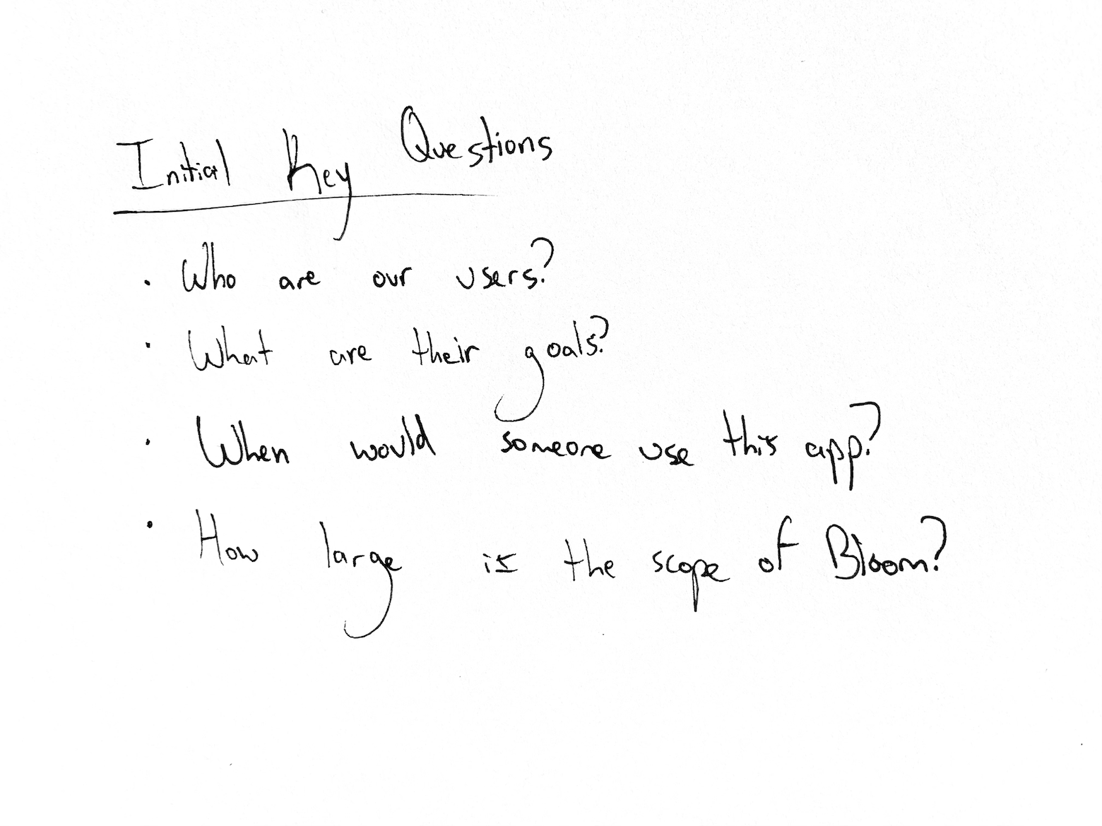
Problem
An agricultural system that doesn’t support local communities.
The drawbacks of our food system are magnified with a pandemic, as it poses a new and immediate threat to our food system on top of those already looming. Supply chains are broken, local farms and restaurants are going bankrupt, and store shelves are sitting empty while, elsewhere, crops are being plowed under because there is no immediate market for them.
Bloom recognized these impacts and presented a solution to this current system by introducing a hyperlocal virtual marketplace connecting local vendors to local consumers. The Harvestly base connects over 100 local companies and producers in SLO County to local consumers, while also reinvesting almost all sales directly back to local vendors and promoting sustainable growing practices.
Challenges
1) How to create an experience that caters to both businesses and consumers alike.
2) Integrate company product’s and shopping seamlessly.
3) Allow users to dive into the food they've bought before.
4) Bridge the gap and establish the relationship between producers and consumers.
5) Mimic the feel of a farmer’s market.


To start off, we started ux testing by conducting semi-structured interviews with registered users of Harvestly who were either using the platform either as a producer or as a consumer. We wanted to incorporate their needs into Bloom, so most of the questions were focused on what was working/not working with the current site.
Competitive Analysis
In order to construct a solid foundation for Bloom, I decided to find out what other food delivery applications were already doing and what user goals they weren’t addressing. I evaluated several features deemed vital from user surveys and identified which ones Bloom could capitalize on to have a leg up over other applications.
Only two out of four main competitors offered a feature that showcased popular products, while three out of the four offered promotional deals for customers who used their delivery platform. While all addressed the basics of the food delivery process, and Grubhub did include local restaurants in users proximity, none showcased local stores that weren’t restaurants but still offered products.

Customer Research
Our customer research was comprised of interviews and sessions with both producers and consumers in the local economy we were targeting. We established four categories of archetypes that we felt embodied a comprehensive representation of our users, which are displayed below.

From our research, it was deduced that there would be two separate flows depending on whether or not you were a producer or a consumer. Consumers were able to see their cart, nearby businesses, and access their profiles, which showed latest orders and location settings. Meanwhile, producers would be able to see nearby businesses, add products, access their cart, and see analytics of their own store including recent sales and most popular items.

Findings
Producers
Needed to add/delete new or old products
Wanted a virtual, customizable storefront
End goal: To see analytics of recent orders
Wanted to be able to also shop other local businesses/producers
Consumers
Needed to be able to see businesses and producers that were close by
Needed an easy way to get the product, either delivered or pick-up
Wanted to browse storefronts without buying


Onboarding Businesses

Synthesis
Producers found the prototyped TestFlight onboarding process to be difficult
USP, reframed, digitalized local markets
Buying products from vendors was unclear
Delivery infrastructure needed to be further developed
The final app needed to comprehensively address both the needs of businesses who needed an easier onboarding process, as well as customers who just wanted to browse local stores instead of making an account. Users of Bloom needed to be able to see the categories and products as showcased on Harvestly’s website, so that they would be able to buy and order with ease.
UX Testing
Based of our findings from our developed prototype stage and a later iteration, we conducted think-out loud sessions with customers and local vendors who were using both the TestFlight version as well as Harvestly’s website. In these sessions, we learned more about what customers felt when they were using the platform at every stage in the user journey. We started incorporating these needs into every iteration following. We then comprehensively put together our findings in the app-store beta version.

Utilizing a bright gradient consisting of earthy and natural colors felt like the perfect fit for Bloom’s branding. The red helps evoke a hungry feeling, and paired with the bright green it creates a nice balance between eager and sensible. The main typeface of choice for the app is SF Pro Text. I felt this typeface best fit the app as it’s extremely versatile through uppercase and lowercase styling, as well as dark and light text fills.

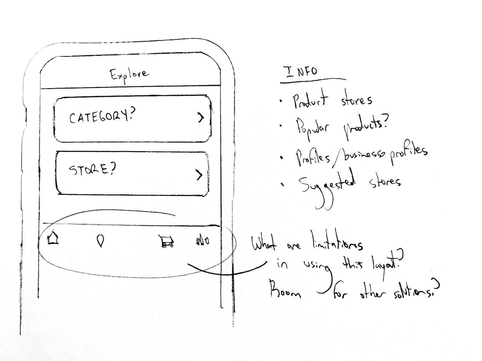
We started off with home category icons that resembled the one-color logo. However, we felt that these didn’t ultimately convey the overall essence of the businesses, so we changed the icons to a different style. These newer icons were much easier to identify and allowed users to move between different business categories at their discretion.
A Simple Category Library
The category icons for Bloom were designed to be easily recognizable across different backgrounds and age groups. These are honest representations of the category itself, which we found communicated better across our different user groups rather than one-color icons.


Producers
Based off the needs of our local producers, businesses, and restaurants, we realized this experience would need to focus on the product and analytics. Our producers wanted their virtual storefront to mimic the feel of their in-person storefront, so we wanted to be able to design a way to personalize this experience for them.

Efficient Producer Onboarding

Consumers
Based off the needs of our customers, we found that the most important things were to be able to see local products easily and to add products to an accessible cart. They also really wanted to browse storefronts without buying and to see stores that were close by.

Your Local Economy, Minimized
Bloom’s structure and system allowed local businesses, microbusinesses, grocery stores, and vendors to share their goods virtually for the first time. As a customer, it was easy to choose a good that was close by and order directly from the vendor, cutting out the middle man and reinvigorating the local economy in the process. As a vendor, the overall flow allowed any business to contact any customer and provide them with the products they ordered in a timely fashion.

On the customer flow, we created an easy way to connect customers to their favorite local businesses by establishing a CTA that allowed users to invite any local business they had in mind to Bloom. If users had already connected their contacts, their contacts would be available to send over an invite and onboard from the attached link.

If local vendors were already close by, the landing page would showcase the profile of these businesses. The businesses were displayed in order of distance, from nearest to furthest away, up to thirty miles. The mile limit was established in order maintain a circular ecosystem, funneling finances to the same economy.

Thank You
Our time with Bloom was short but sweet. If you’re curious about what the team is up to now, check out the largest farmer’s market in the country and shop some local goodies while you’re at it.
“So delicious, so fresh, we are hooked. We order weekly and it is an event at our house when the delivery arrives of farmers market items to our door.”
— Registered customer on Harvestly
“We needed this five years ago.”
— Local Co-op